
SYDNEY OPERA HOUSE EDM REDESIGN
BUSINESS CHALLENGE
How might we increase the clickthrough rate from Sydney Opera House Emails to the website?
Sydney Opera House sends out over 800,000 emails per week, across 8 content channels, to over 500,000 people. In 2019, the average clickthrough rate to the website was 6%.

Previous EDM Design
KPI’S
Primary: Redesign the information hierarchy to increase the clickthrough rate,
Secondary: Increase ticket purchases as a result of increased clickthrough.
RESEARCH
I conducted a workshop with the internal email operations team. In this workshop we:
1). Presented and analysed customer feedback
2). Discovered the internal email operation team’s pain points and
3). Found opportunities we could offer to extend a positive customer experience and leverage the brand
Some notes and sketches of the process
COMPETITOR ANALYSIS
I created a visual and verbal competitor analysis across competitor emails; as well as conducting a visual analysis of the newly created Sydney Opera House What’s On webpage, as this was seen as the benchmark for design.

Visual analysis to understand why the new What’s On page is considered on brand.
INSIGHTS
Customer insights
– It was not mobile-friendly
– Call to action buttons were poorly located
– There was a lot of content to go through before finding ones that are relevant for them
Internal team insights
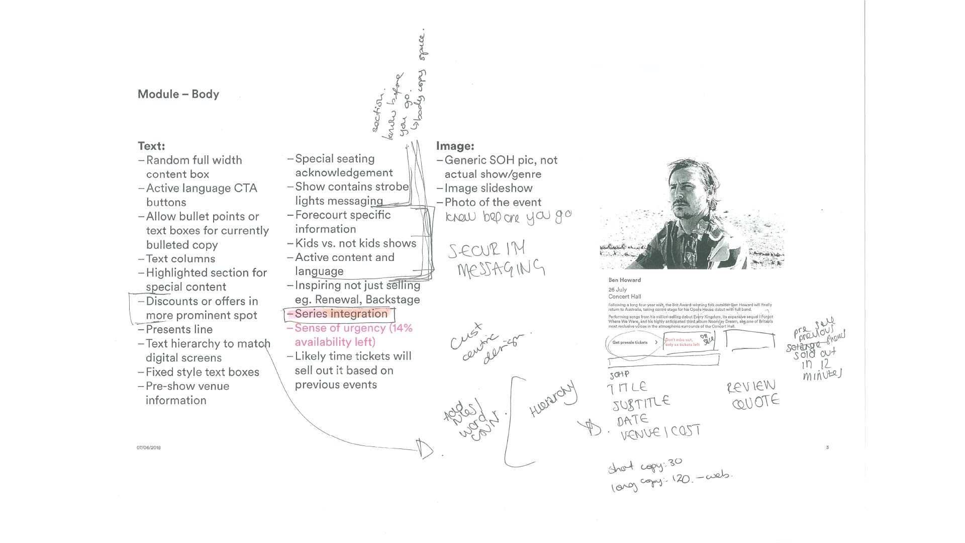
– Time pressure to put each EDM together
– Pressure from other teams to include their content
– Challenge to place text hierarchy
– Challenge to aesthetically make it look on brand
Further opportunities
– Easy to gauge what kind of EDM our customer is receiving, ie. What’s On, Thank You, Your Ticket
– Personalised content based on previous purchases and stated genre preferences
– Ability to cross-sell events and shows
– Testing conducted from the newly designed What’s On page showed a significant improvement in user navigation
– Align new work with the What’s On page
PERSONAL PROBLEM STATEMENT AND EXPECTATION CHASM
I wanted to put our users in the heart of the solution so I set myself a personal problem statement, with the belief: if I can provide a solution that meets the following requirements, it will meet the original business challenge.
How might we:
– Create a positive experience for our customers?
– Surprise and delight our customers to create an enjoyable journey?
– Create an easy to use platform for the internal team?
– Include other important brand offerings?
UPDATED OBJECTIVES
I took my findings back to the stakeholder team, and as a result shifted the key objectives to be:
– Create a consistent, seamless user experience from SOH EDMs to Website
– Explore mobile-first responsive design
– Provide flexibility of usage
– Ensure consistency of brand design and language
THE SOLUTION
A modular, mobile-first responsive template.
There were a few factors that I created to answer each key insights:
1. Designing mobile-first
I put design for the mobile application first. However, I ensured the design is responsive and would work within a desktop format too.
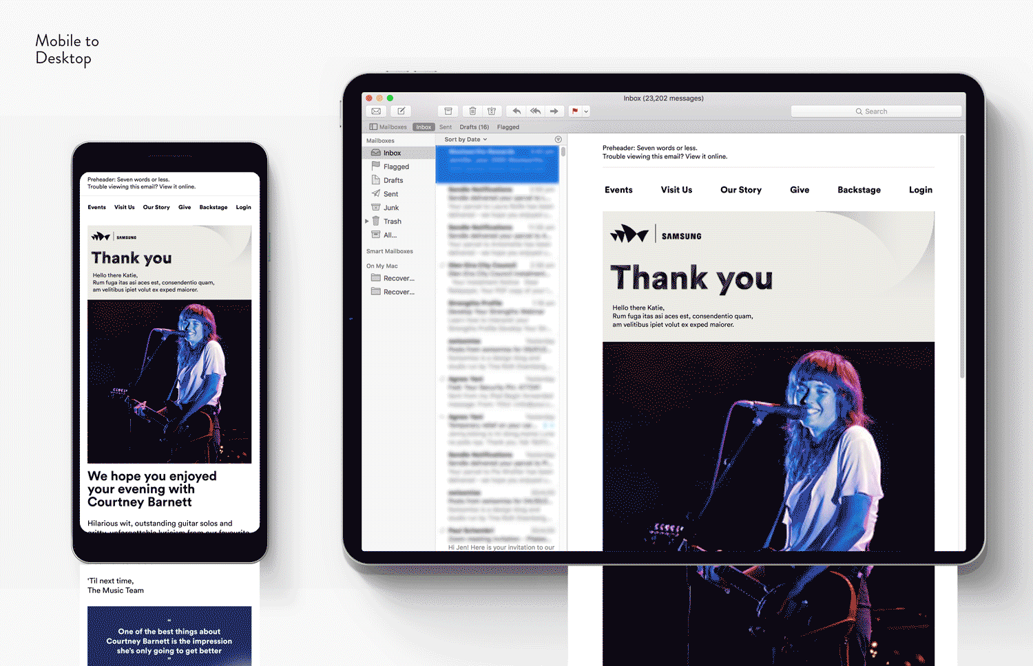
2. Applying the same visual aesthetic as the What’s On web page
There are four elements discovered during the visual analysis that could be carried over to the EDM to create a cohesive brand look (marked with magenta in image below):
– Navigation,
– Circular typeface,
– White space, and;
– Consistent button language
3. Enhanced experience through applying email best practices
I added extra factors to enhance our customers’ experience (marked with cyan in image below):
– Adding a personalised salutation
– Bite size content .
– Specific elements relevant to each EDM. For example, adding a concert gallery for our customers to relive the moment in our thank you email (illustration in the above image).

What’s On mobile high fidelity wireframe: Taking into consideration visual language and email trend benchmarks.
4. Creating a modular system
By creating a prefilled modular system, I allowed for ease of build by the internal email operations team, resulting in the ability to:
– build the EDM quicker
– apply content hierarchy
– categorise content for ease of navigation
– stay on brand

What’s On mobile high fidelity wireframe: Example of modular system being used
FINAL TEMPLATE DESIGNS

Click image to play or open video in new window
RESULTS
By placing the customers’ experience at the heart of the solution, we created a positive user experience. Within the first two months of launch, the new EDM redesign has doubled the click through rate from 6% to 12%.