HUMANFORCE
Brief
Humanforce is known in the desk less industry as the best Human Capital Management software. The success of its product propelled them into becoming a scale-up tech company. Following this growth, Humanforce saw the need for its brand identity to reflect who they are.
Through a series of strategic brand workshops, we identified the need for Humanforce’s brand identity to have a more balanced approach. We wanted to evolve it from being too product-centric to having a greater focus on people. This was backed by Humanforce’s purpose – Make work easier and life better.
Visual outcome
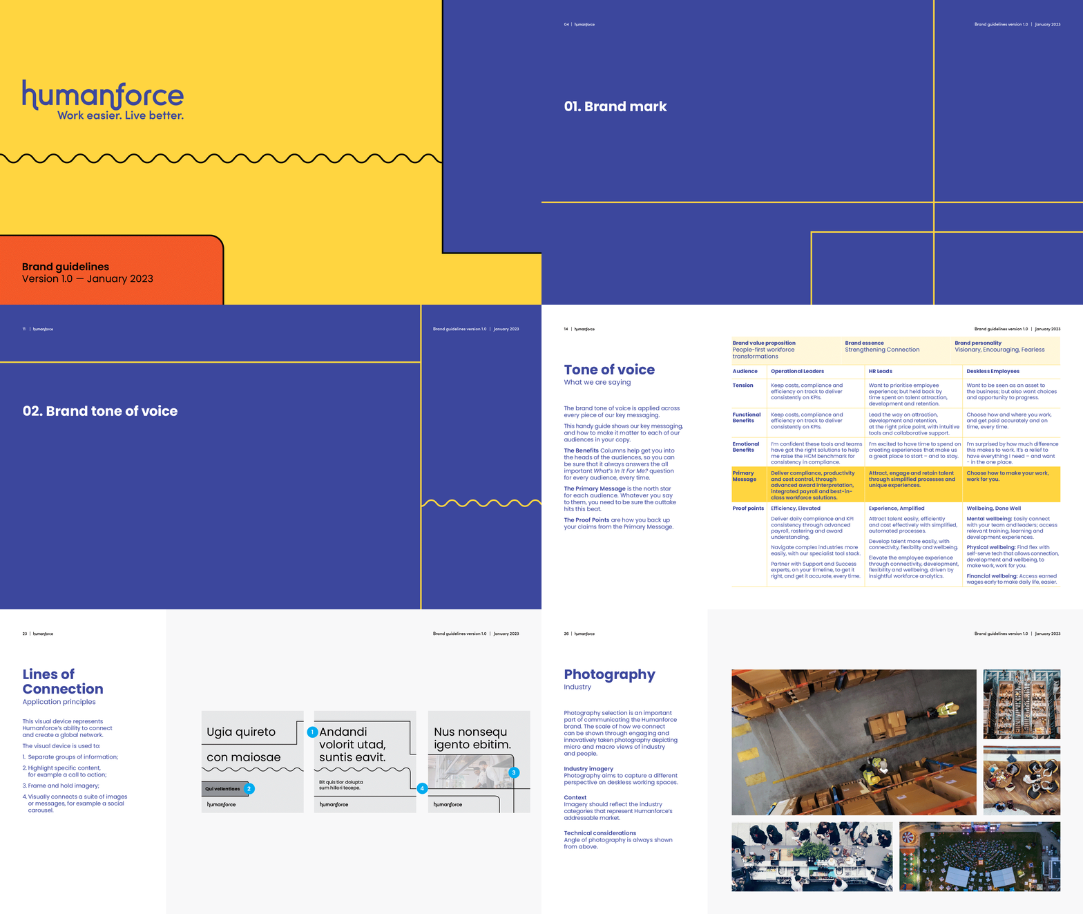
We injected “humanity” into the brand through all aspects of its toolkit. From softening their tone of voice to evolving their colour palette, and choosing typography that is more rounded with a softer edge.
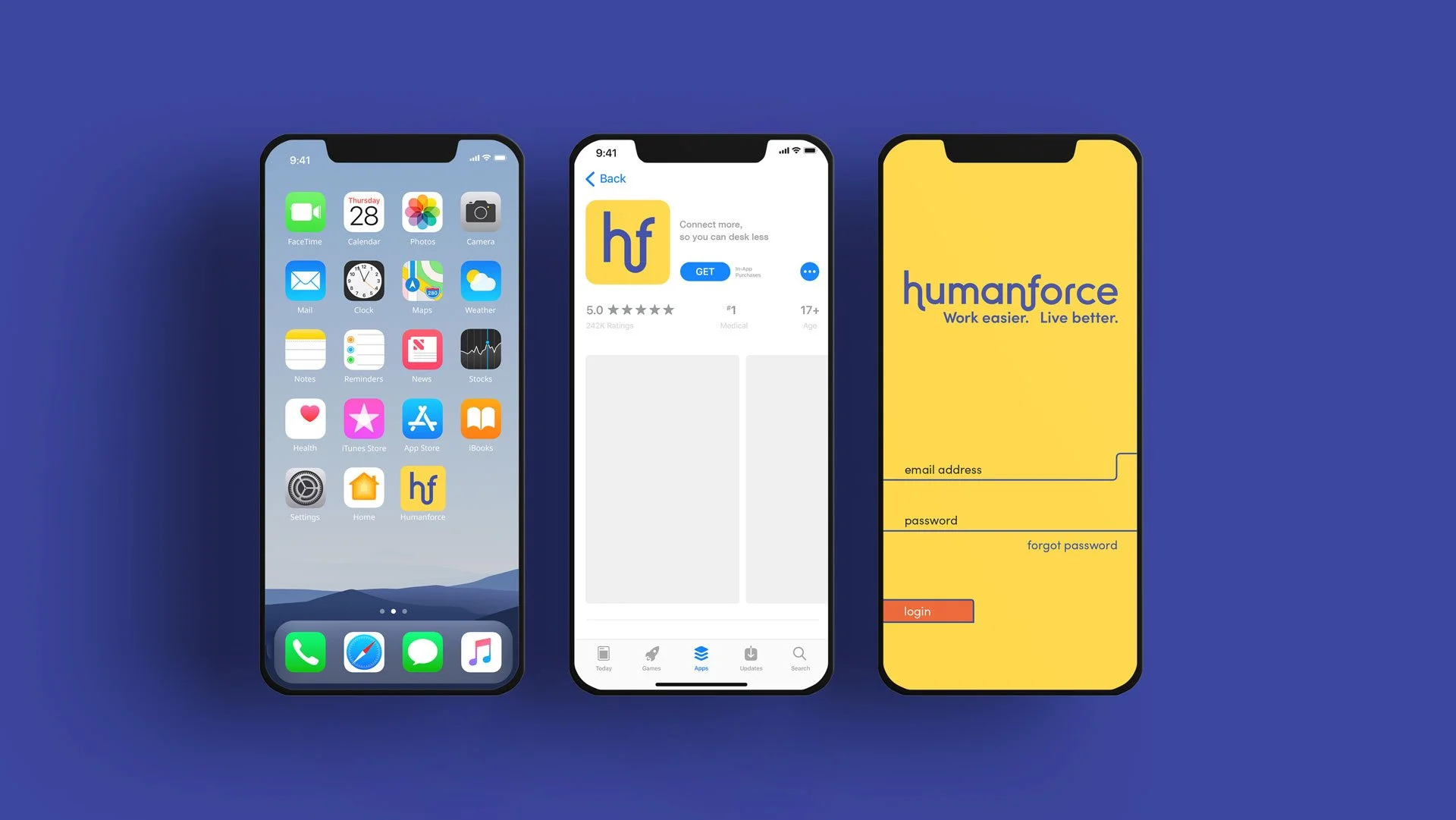
The Humanforce brandmark itself is a visual representation of their purpose; connecting people (human) and technology (force). We also created a rigorous visual device (three lines of connection), which represents human connection and networking – connecting with humans around you, and networking to make work easier and life better.


